


GOAL
Redesign the entire user experience for Western Digital’s flagship product – My Cloud. This is a personal storage device customers own and cab access from any device using cloud technology.
ROLE
As the Principal Designer and interim Director, I helped establish methodologies, design processes, vision pieces, prototypes, responsive design framework, interaction patterns, visual language, fostered a design culture where everyone honed their craft, built strong relationships with stakeholders, and evangelized UX strategies throughout the entire organization.
We introduced responsive breakpoints to Western Digital. To help the development team quickly ramp up with this approach, we created a t-shirt scale diagram for the recommended breakpoints.
This was the first step in laying out the page framework.
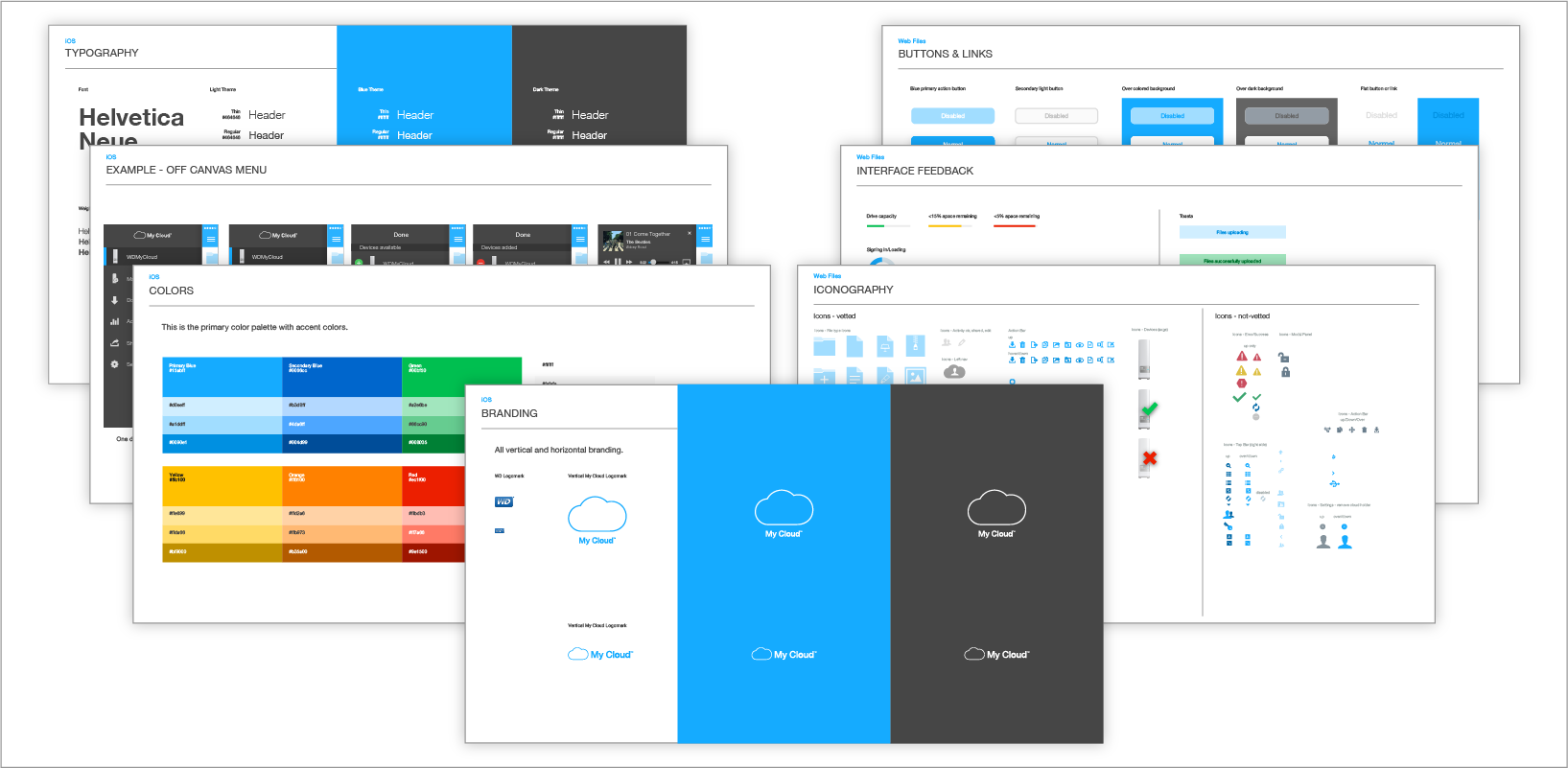
I leveraged my formal training in Swiss Style graphic design to lead a comprehensive visual redesign to ensure there was a cohesive modern look and feel across all of Western Digital's products, touch points and platforms.
The guiding adjectives for the new visual language were "minimal" "light" and "airy". The new visual language included in a thiner logo, modern Helvetic Neue font, modern color palette, and the use of lots of white (negative) space.
I presented the new language to Western Digital's executives and the head of Marketing which was received with unanimous support.
PHASE 1
1) Identified leading cloud storage competitors which had a native app for boarding.
2) Captured screen shots of competitor's onbarding process, and arranged screens into flows using Sketch.
3) Added labels above sections of the flows to help compare onboarding steps between apps.
4) Printed flows using a plotter and posted on the wall. Added interaction lines to identify transitions from screen to screen.
5) Facilitated working sessions across the entire organization to identify the following using sticky notes:
• what IS working (green)
• what IS NOT working (red/orange)
• general input (yellow)
A significant amount of design effort was given to simply the onboarding process and create an emotional connection to the new MyCloud product and brand.
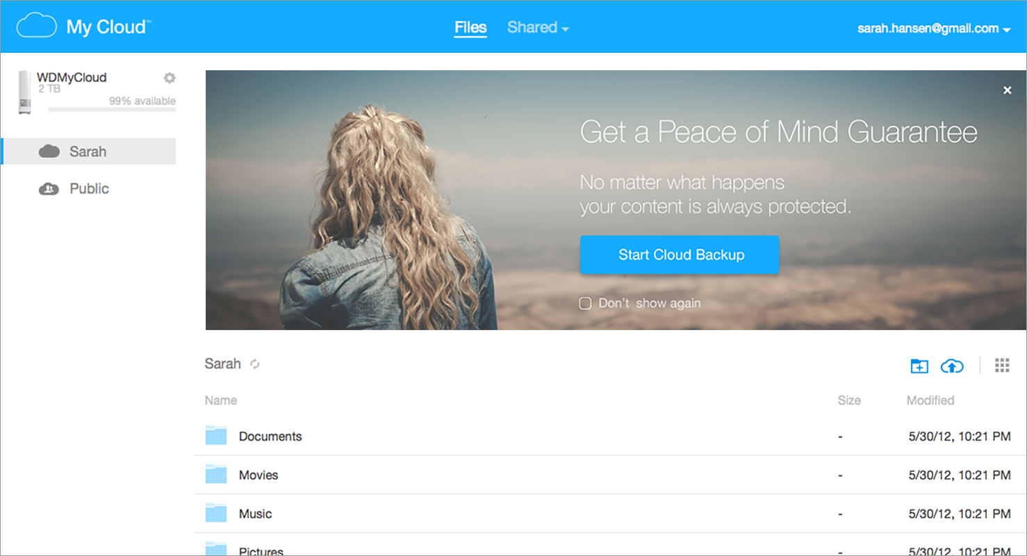
The list view provides quick access to folders and files. Actions can be performed at a folder or file level. A module appears at the top of the page when there are relevant alerts, notifications, or promotions.
The image rich grid view as new addition for My Cloud. A sophisticated cropping algorithm was used to display images in a compelling way. While the height of tiles were fixed, the width of photos were cropped.
To ensure a cohesive customer experience, I lead an initiative to redesign the My Cloud email templates so they incorporated the new visual language and had a responsive layout.
I worked very closely with the Corporate Marketing Team to leverage long-form story telling for the home page and ensure that front door experience was consistent with the onboarding and product experience.
This was achieved by providing wireframes and comps as well as the new Visual Style Guide and Photo Style Guide.
GOAL
Create the user experience for Western Digital's new wireless storage device – My Passport Wireless Pro. This product gives photographers and videographers portable storage to easily offload, edit and stream photos or high-definition videos in the field. Designed to work seamlessly with mobile devices, and an SD card reader built-in.
ROLE
As the Principal Designer, I updated a storyboard, created a flow diagram, final mocks, and assets for both iOS and Android mobile apps.
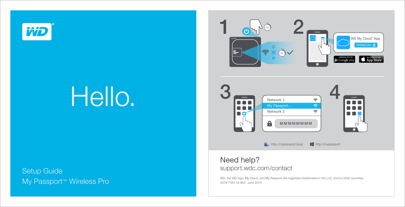
Created a high level storyboard to communicate concept to both internal and external stakeholders.
A two-sided card to provide an easy visual guide for users to set up their My Passport Wireless Pro device for the first time.
I created a flow diagram to cover every step of users' inaction with the product: onboarding, setup, and post setup.
I created the interaction design, visual design and content for both iOS and Android screens. I used a Sketch plugin to seamlessly export all the assets for the various iOS sizes and Android DPI resolutions.